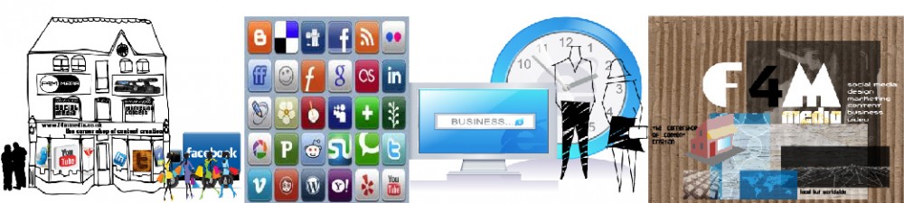
When you are looking to get your message across it is important to bear a number of things in mind:
- the make-up of the content you are putting out there, that it has the right written message as well as the right illustration
- that the sorts of imagery sits well alongside the text, here not only graphics or photo illustration have an impact but also video which is becoming more and more important
- that you are putting things out on the right channels, this means choosing out of not only your website or blog but also from a range of social media channels, some based around text, like twitter, some based around imagery, like pinterest and instagram, some based around video, like youtube and vimeo
- all of this works better, as well, if those posts are timed properly, on a day and at a time that reaches the eyes, ears and minds of as many interested people as possible
Here are a few ideas:


One thing I’ve learned on social media is that what time you post something makes a big difference. While it’s not an exact science, picking when to post on social media is a good strat…
Source: Best Times To Post on Social Media – Molly Kate Communicates


 via Muzli design inspiration
Source: Design Trends — Rounds
Here – a local business helping other businesses with their needs. They supply, support and so much more.
 Source: S Clough Ibbotson & Co Ltd ~ Home

A design bundle packed with goodies
Source: Affiliates | FontBundles.net


 An interesting visual presence above the scroll is the first impression a user gets of a website. Whether that user continues to click can depend on a number of things, including imagery, readability and overall interest in the content. This month we are looking at three trends that make a distinct first impression—dark color overlays on images, brutalism and hollow lettering styles. Here’s what’s trending in design this month: 1) Dark overlay on images It doesn’t matter if the hero image is still or moving, a dark color overlay can help even colors in a way that makes it easier to add text and other elements to a layer on top of the image. While this might sound like a shortcut at first, there’s a lot of value in this technique. The primary reason to opt for a color overlay is to enhance readability. Most images contain light and dark color variances, making it a challenge to add lettering that is readable on every device. Even if there’s a perfect placement for desktop wide screens,
Source: Essential design trends, February 2017 | Webdesigner Depot


 by Nick Babich
Source: Trends in Modern Web Photography
